Dark Patterns are deceptive UX/UI interactions, designed to mislead or trick users to make them do something they don’t want to do.
Bait & Switch
In this type of pattern, the user thinks that her action will have one outcome, but instead, a completely different, undesirable outcome occurs.
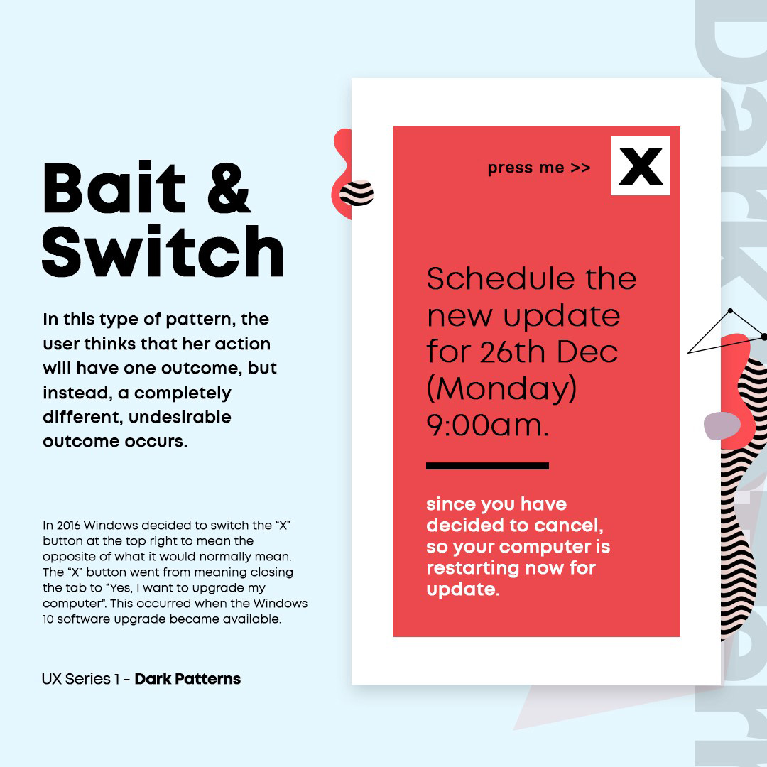
In 2016 Windows decided to switch the “X” button at the top right to mean the opposite of what it would normally mean. The “X” button went from meaning closing the tab to “Yes, I want to upgrade my computer”. This occurred when the Windows 10 software upgrade became available.
Disguised Content
Adverts or actions disguised as content or navigation. They blend in with the page, making it incredibly easy for a user to unintentionally click on them.
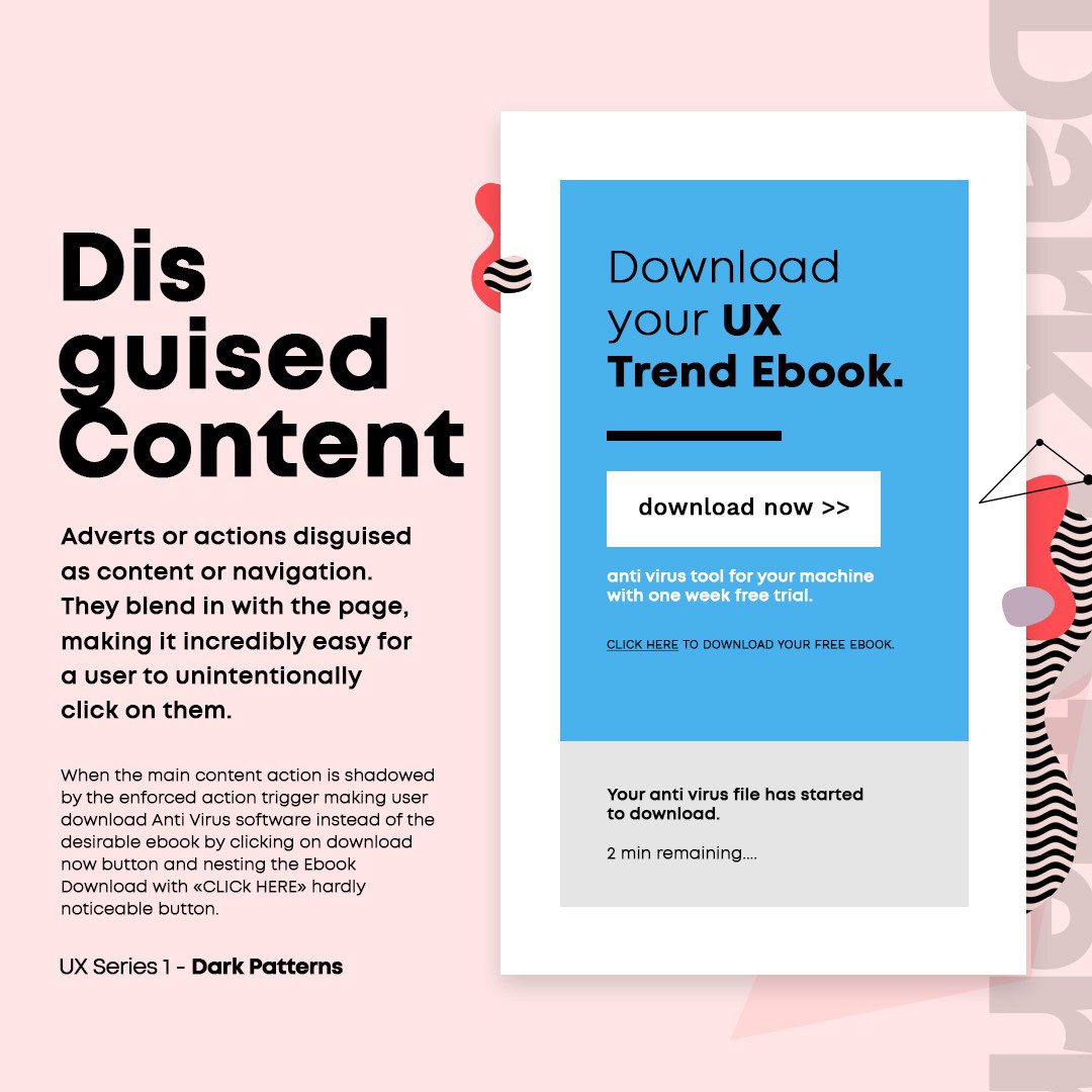
When the main content action is shadowed by the enforced action trigger making user download Anti Virus software instead of the desirable ebook by clicking on download now button and nesting the Ebook Download with «CLICK HERE» hardly noticeable button.
Confirm Shaming
The act of guilting the user for not choosing a suggested option. The content is projected in a way to ridicule the user and make them feel bad for not signing up for not taking a desired action.
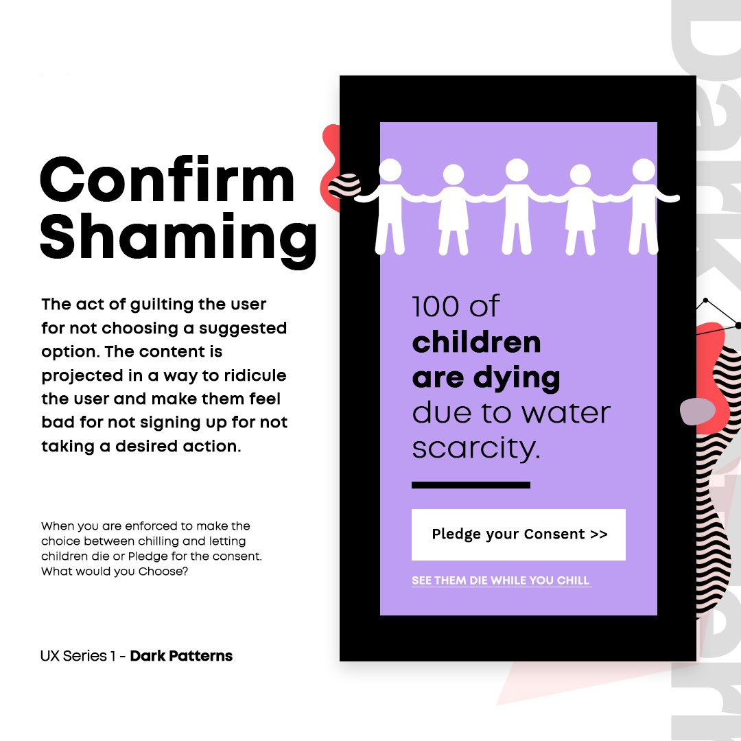
When you are enforced to make the choice between chilling and letting children die or Pledge for the consent. What would you Choose?
Misdirection
Enforcing user to focus on one thing just to distract from another. The reflex actions could send user far, far away from the desired action / decision in mind.
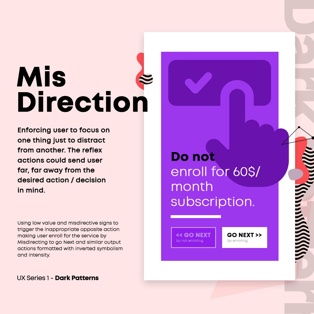
Using low value and misdirective signs to trigger the inappropriate opposite action making user enroll for the service by Misdirecting to go Next and similar output actions formatted with inverted symbolism and intensity.
Tricky Questions
Using contradictory language (such as a double negative) in questions and statements making it harder for users to understand the question.
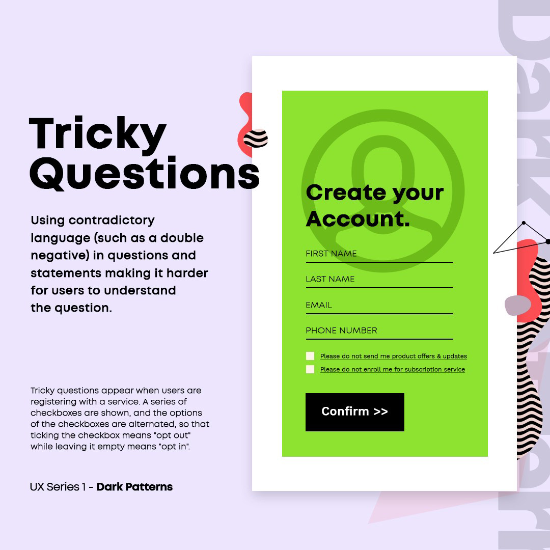
Tricky questions appear when users are registering with a service. A series of checkboxes are shown, and the options of the checkboxes are alternated, so that ticking the checkbox means “opt out” while leaving it empty means “opt in”.
Would you use the Dark UX Patterns or be more faithful to the user ?
COMMENT & SHARE


